
Website design is a crucial aspect of any online presence, as it can make or break the user's experience.
The key elements of effective website design are color, typography, and imagery.
These elements can be used to create a visually appealing and engaging design that speaks volumes to the intended audience.
Let’s explore the importance of choosing a limited color palette, creating visual interest with typography, and using imagery to tell the story of your brand—and we’ll show you the brands that really pull it off perfectly.
First: Color!
.png?width=1200&height=628&name=Color%20in%20website%20design%20(1).png)
Color evokes emotions, creates a sense of brand identity, and guides the user's eye through the design.
When choosing colors for a website, always consider:
- the audience
- the message
- the overall aesthetic
Best practice for using color in website design:
- Use a limited color palette to create a cohesive design (we vote monochromatic—one color works like a charm).
- If you use more than one color, use contrasting colors to create visual interest and guide the user's eye.
- Use color to make important information pop.
Examples
- Apple uses a minimalistic color palette. White and gray are the main colors, with black and red accents (sometimes).
- Mailchimp uses a bright, cheerful color palette to reflect its fun and approachable brand.
Close Second: Typography

Typography is the art and technique of arranging type to make written language legible, readable, and appealing.
When choosing typography for a website, it's important to consider legibility, readability, and style:
- Limit the number of font families in the typography to create a cohesive design.
- Work in different font weights and styles to create visual interest and information hierarchy.
- Use web fonts for better cross-device compatibility.
Examples
- Dropbox uses a clean, modern font to reflect its focus on simplicity and efficiency.
- Netflix uses bold typography to create a sense of energy and excitement.
From the Growth Design Team Expert Vault:
Typography vs. Font: What’s the Difference
Typography refers to the actual design of characters and typefaces.
A font, however, is a set of type sorts of unified design: usually an alphabet (and all its accessory characters of a single style and weight).
And Third: Imagery
.png?width=1200&height=628&name=How%20to%20Use%20Color%2c%20Typography%2c%20and%20Imagery%20Effectively%20in%20Website%20Design%20feature%20(1200%20%C3%97%20628%20px).png)
Imagery inspires interest, conveys a message, and creates a sense of atmosphere and mood.
It can take many forms in a website design as the visual representation of a subject or concept:
- Videos,
- Photographs
- Graphic design
- Animations, and more.
When you choose the imagery for a website, consider the context, the composition, and the style. Here are some tips:
- Create a professional, polished look with high-quality images.
- Find and use images that tell the story of the brand.
- Guide the user's eye and create visual interest with images chosen to do so.
Examples
- National Geographic uses powerful, high-quality imagery to create a sense of wonder and inspire curiosity.
- Airbnb uses photographs of real homes and people to create a sense of authenticity and connection.
Truth: there are a gazillion ways to delight a website user, but deceptively-simple, key elements like color, typography, and imagery are all powerful ways to create an appealing, effective website that works.
If you’re working on a website design that needs attention, let us take a look. Our designers are experts at combining great storytelling with design concepts that make your brand stand out and your customers line up.
Tell us what you need. We’re right here.

-
 growth operationsFeb 28, 2024
How GrowthOps is Transforming the Education Industry
In the ever-evolving landscape of the education sector, Growth Operations (GrowthOps) emerges as a...
-
 Non-ProfitFeb 28, 2024
How GrowthOps is Transforming the Non-Profit Industry
In the ever-evolving landscape of the non-profit sector, Growth Operations (GrowthOps) has emerged as a...
-
 growth operationsFeb 19, 2024
Harnessing Growth Operations: Aligning Sales, Marketing, and Service in 2024
As we navigate the competitive landscape of 2024, the intersection of growth operations and the flywheel...
-
 Marketing StrategyFeb 28, 2024
How GrowthOps is Transforming the Private Equity Industry
In the fast-paced world of private equity, Growth Operations (GrowthOps) is emerging as a transformative...
-
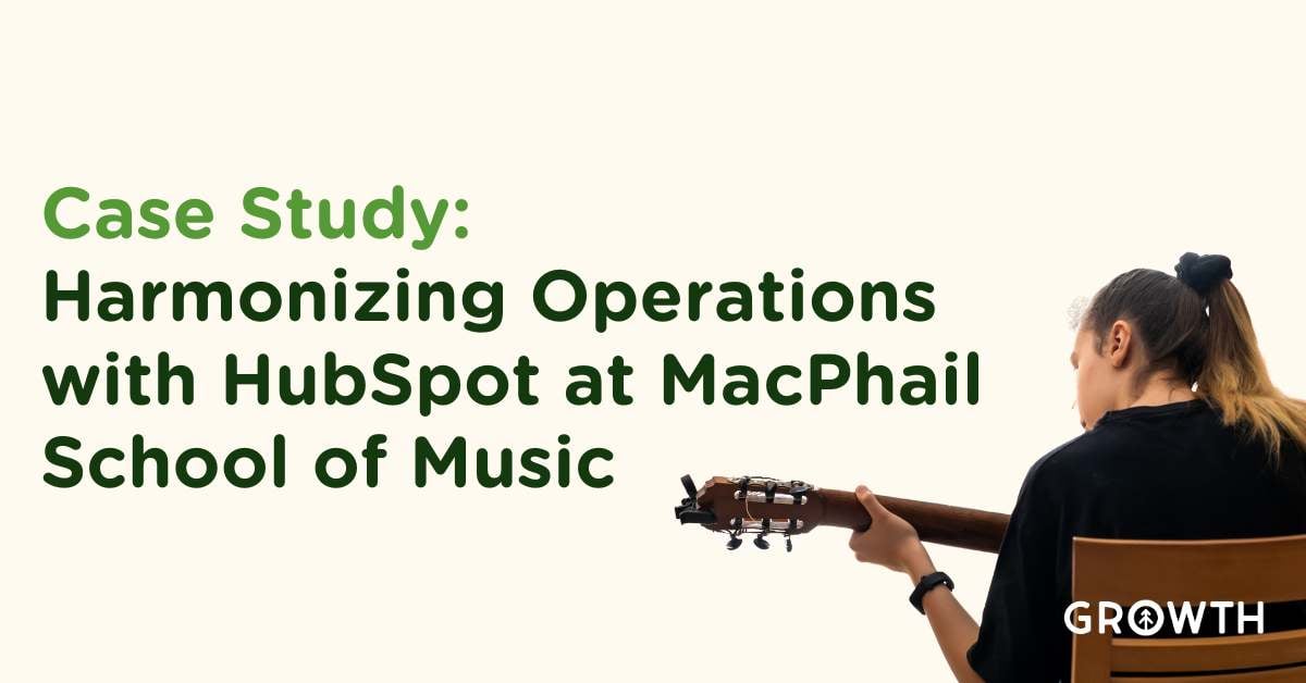 Case StudyFeb 18, 2024
Case Study: MacPhail & Growth: A Symphony of Success with HubSpot Integration
Starting in December 2020 and continuing robustly into 2024, MacPhail School of Music and Growth embarked on...
-
 growth operationsFeb 28, 2024
How GrowthOps is Transforming the Healthcare Industry
The healthcare sector is experiencing a paradigm shift, significantly influenced by Growth Operations...
-
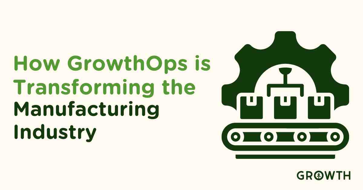 B2BFeb 28, 2024
How GrowthOps is Transforming the Manufacturing Industry
The manufacturing sector stands on the brink of a new era, with Growth Operations (GrowthOps) leading the...
-
 Website DevelopmentApr 27, 2023
Growth Office Hours: Google Analytics 4 Overview
Overview: Date Recorded: April 25th, 2023 Topic: Google Analytics 4 Speaker: Chris Nault
-
 Inbound MarketingMar 11, 2020
The Challenges of Starting-up: Small Business Growing Pains
Let’s face it, this is the age when startups are breaking out everywhere and the sheer enthusiasm being...
